42 minutes
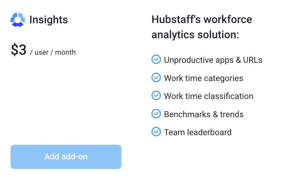
Hubstaff Insights Add-on
Level up your team’s efficiency and productivity by using the Hubstaff Insights add-on.
With Hubstaff Insights, you can view and compare activity benchmarks, define productive and unproductive apps and URLs, and compare your team’s productivity by work location using Remote vs. Office tracking.
You will get a 3-month free trial on the Team plan, and it will then be charged once the trial expires unless you remove the add-on first.
Add-ons are not available on free plans.
Organizations on Starter plans will not have access to productive/unproductive apps/URLs and productivity scores.
Signing up for the Insights add-on
(Organization Owner roles have access to subscribe to add-ons)
Step 1
To sign up for the Insights add-on, navigate to Settings > Billing.

Step 2
On the Insights box, click Add add-on.
Step 3
The confirmation dialog will appear. It will display the total cost of the add-on as well as how many users count towards the price. Click Add add-on to continue.

Step 4
You will see the add-on enabled. If you’re on the Team plan, you will get a 3-month free trial. The paid version will automatically start when the trial ends. You will see a banner showing the trial’s expiration date.

a
Insights page
The Insights page can be accessed via the Insights menu on the dashboard sidebar.
![]()
Let’s break down the insights page per section.
Navigation
The top section includes a snapshot of your team’s productivity for ease of access to critical metrics. This includes the following:
- Settings – allows you to define productive/unproductive URLs.

- Date picker and timezone selector – select the date range for the data you wish to view. You can also change the timezone when you select the daily views (today/yesterday).

- Teams/member picker – allows you to choose teams or specific team member data.

- Detailed teams/member picker – allows you to choose teams and/or individual team members.


Engagement score
Engagement scores are a quick way to analyze how team members are doing, and helps managers to understand and identify which team members need help or are performing.

Interpreting the score
If the final score is 100, it means that the member sits perfectly on their job type’s median values, which is a good indicator. The score could exceed 100 points, which until a certain point is also a good indicator, meaning that the member is more engaged than the normal values for the job type. But after a certain point, it starts indicating burn out or cheating behavior.
What must be setup to calculate an Engagement Score
-
Track Apps & URLs must be set to “ON”.
-
Each individual must have an occupation set.
-
Individual must be tracking time with the Hubstaff desktop app.
-
Engagement score must have time to calculate for the filtered date range. For example data currently being tracked “Today” may not have Engagement Score data yet calculated. Similarly on Monday the score may not yet be calculated for “This Week” date filter.
Benchmarks
The benchmarks tab shows the typical performance range for users in your industry, organization, or job type, so you can compare your selected team members against it.
Below is a sample comparing an organization’s activity to other industry average.

Remote vs. Office
The Performance page includes a Remote vs. Office tab that replaces the standard benchmarks view with a location-based breakdown of your team’s productivity.
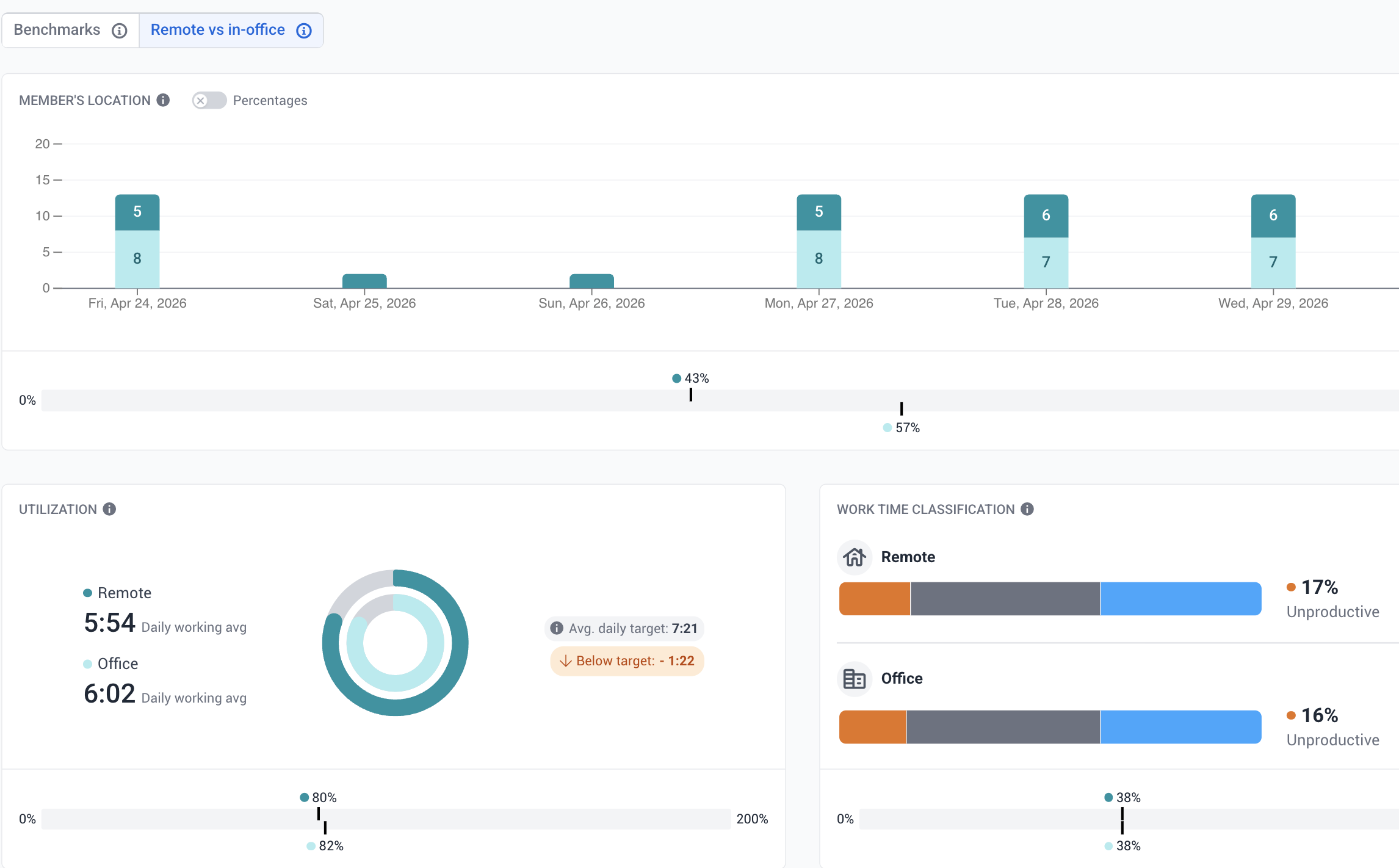
When enabled, Hubstaff uses network data (your team’s public IP address and router MAC address) to automatically or manually identify office locations. Owners, managers, and team leads can then compare metrics like utilization, idle time, start/end times, and core work across remote and in-office sessions.
This feature requires network data collection to be enabled and is supported on the desktop app and silent app only.
Highlights
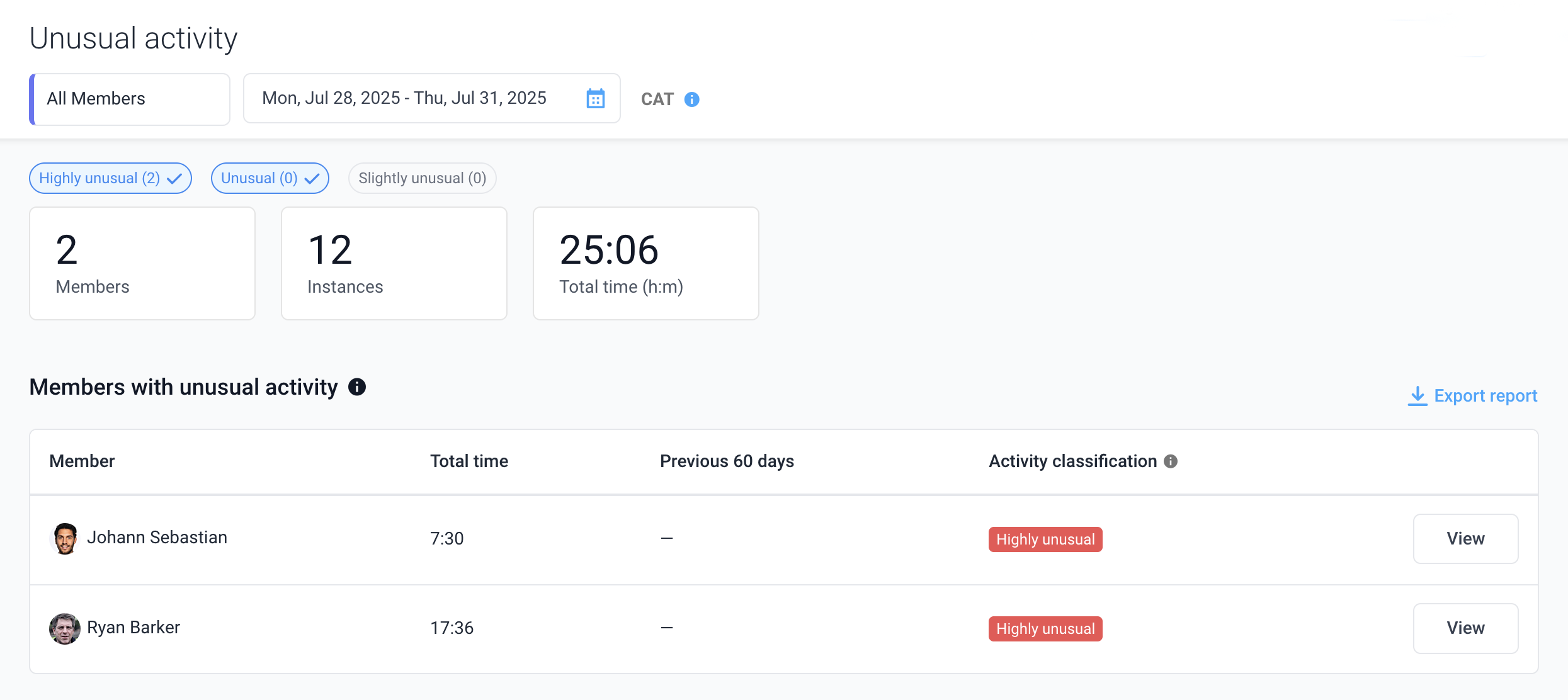
Unusual activity widget
The Unusual activity widget can display individual data or team Unusual activity data as shown below and is located under the Insights > Highlights page.
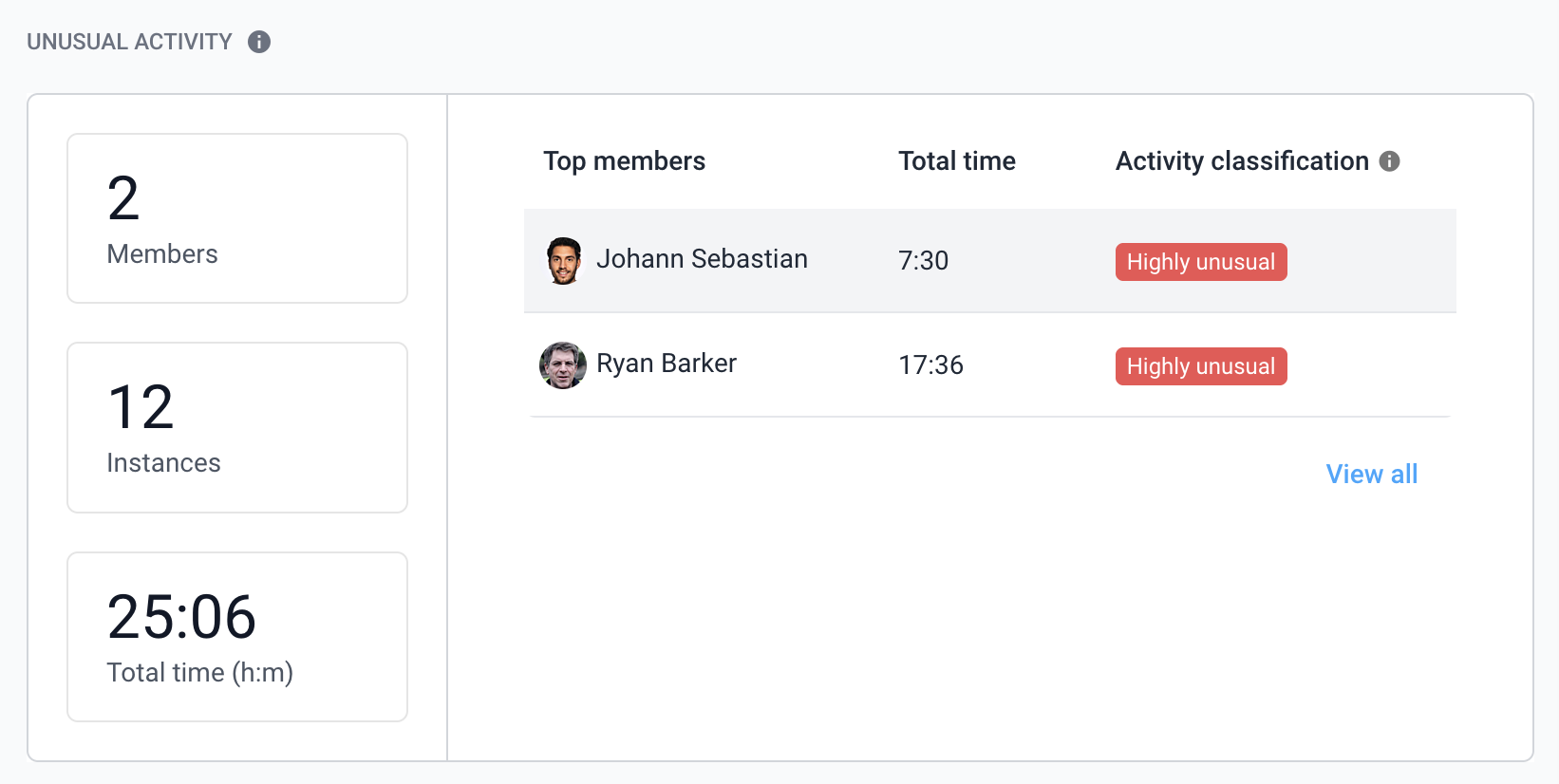
Note: Adjust the date range to see unusual activity within different days.
Significant changes in behavior
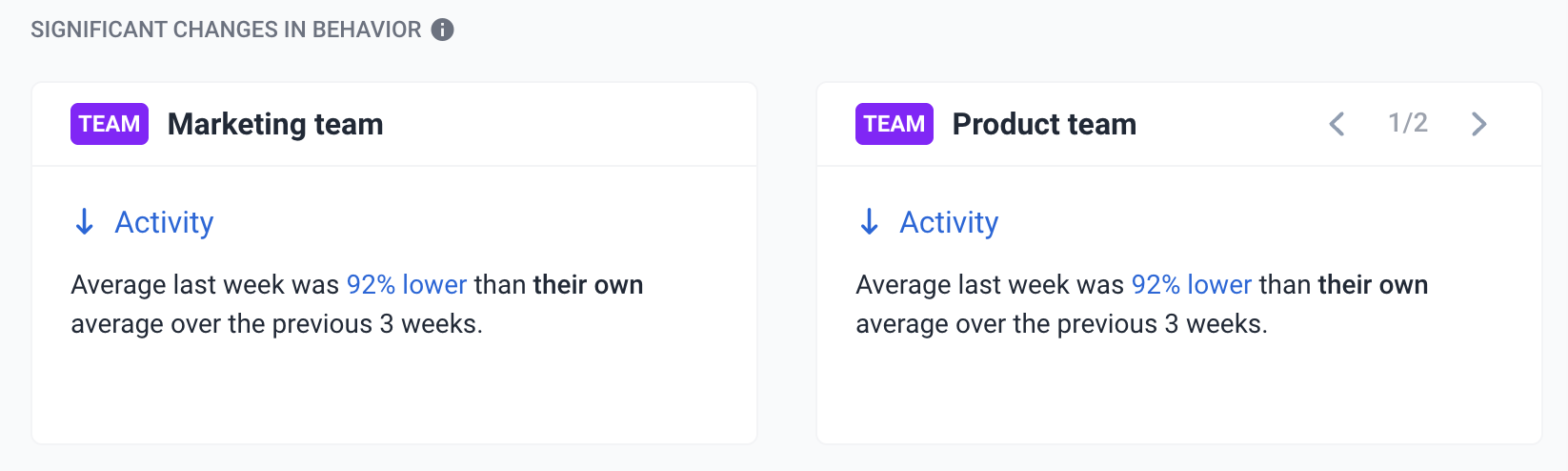
The highlights section will show you differences in metrics between teams/members using the below stats:
- Avg. activity (percentage) per day/week/month.
- Avg. worked time (hours) per day/week/month
- Avg. time gap (percentage) per day/week/month
- Avg. core work (percentage?) per day/week/month
- Avg. number of projects and/or tasks worked on per day.
Additional data:
- Work gaps
- Focus time
- Core work
- Schedules
- Projects – how many projects is someone assigned to?
- Allow management to set goals per member for each
- Track improvement over time
You can also toggle left and right on select cards to see more highlights about each user/team.

Performance
Widgets
Utilization
Helps managers balance workloads by setting targets for how much their team should work and inform them when members are under or overworked. The bias should be on the left if a user is underworked and the opposite when the bias is on the right. This is based on the average work hours spent by your team members vs. the average work hours set based on their weekly limits.

Organizations can customize the Expected work hours via the Members page so they can see Utilization based on how much members are expected to work.

Work time classification
The percentage of core productive apps and URLs over total time spent.

Example: An employee worked for 10 hours. Of that time, 30 minutes was added manually, the user was on unproductive apps/URLs for a total of 45 minutes. Their productivity score would be 87%, with this breakdown:
-
- 87% Productive
- 8% Unproductive
- 5% Unclassified
Daily focus

-
A focus work session is considered when members track time to one project or task for 30+ min without interruptions.
-
Metrics are calculated per member/day
-
The widget shows you how much time your team spends in focus mode.
Definition:
- Focus time – Average daily total focus time per member
- Sessions – Average # of sessions within the selected time period
- Average length – Average focus session length, or duration, per member / da

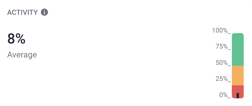
Activity
The percentage of keyboard/mouse activity against total time tracked. For more information about how activity is calculated in Hubstaff, click here.
Meetings

Gain valuable insights by connecting your team’s calendars. You’ll know when:
- Meetings are taking up too much time;
- People distracted during meetings;
- If meetings have too many attendees;
- How many meetings are recurring
- Amount spent on meetings
How does it work?
First, an administrator needs to sign in to either their Google or Microsoft account via the Insights > Meetings widget.

- The meetings widget integrates with either:
- Google Workspace
- Microsoft Office 365:
- Emails sent, received, unread
- Amount of calls, time spent on calls
- Messages sent and received
- Collaboration data
- It shows the number of meetings the selected party (all members, user, or team) has participated in during the selected time period.
- Totals the duration of time spent in those meetings
- Filter out events that we don’t think are meetings
- Rules:
- Event must have more than 1 attendee
- Must be an event type (not a reminder or to-do)
- Rules:
- It calculates the cost of meetings
- Determines if a meeting event is internal or external
- This only works if everyone in the company uses a company email address. If so, we can determine if all attendees have email addresses on the company’s email domain
Work time expenditure
Apps and URLs visited by your team is grouped into categories are displayed here according to their classification.

Team collaboration
The meetings widget integrates with either:
Google Workspace
Microsoft Office 365:
Emails sent, received, unread
Amount of calls, time spent on calls
Messages sent and received
Collaboration data
Top Apps and URLs
Top used applications and URLs within the timeframe specified.

Leaderboard
The leaderboard shows a descending list of team members based on productivity. It also shows each user’s total time tracked, activity, productivity and any achievements they have earned.

You can also:
- Click the View all button to expand the leaderboard list to view all team members, or;

- Toggle the Trend data button to compare trends from the exact period prior to the chosen period on the date selector which looks at the same number of days in the previous timespan. For example, if today is May 5th, the trend data is only calculating it compared to the first 5 days of April.


Categories
The categories widget displays the top recorded application and URL category types shown in descending order based on usage.

Timeline
The timeline view displays time tracked broken down into visual classifications on a timeline.
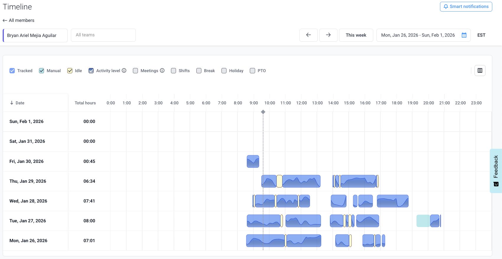
Data can be filtered via the following time types:
Time tracked
This is the regular time tracked by an employee where they are actively.
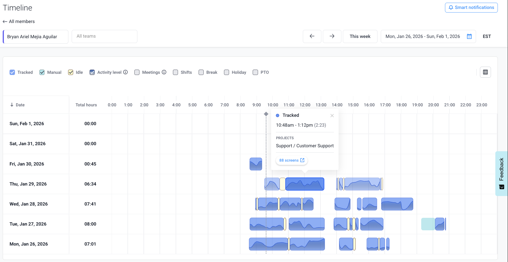
Manual time
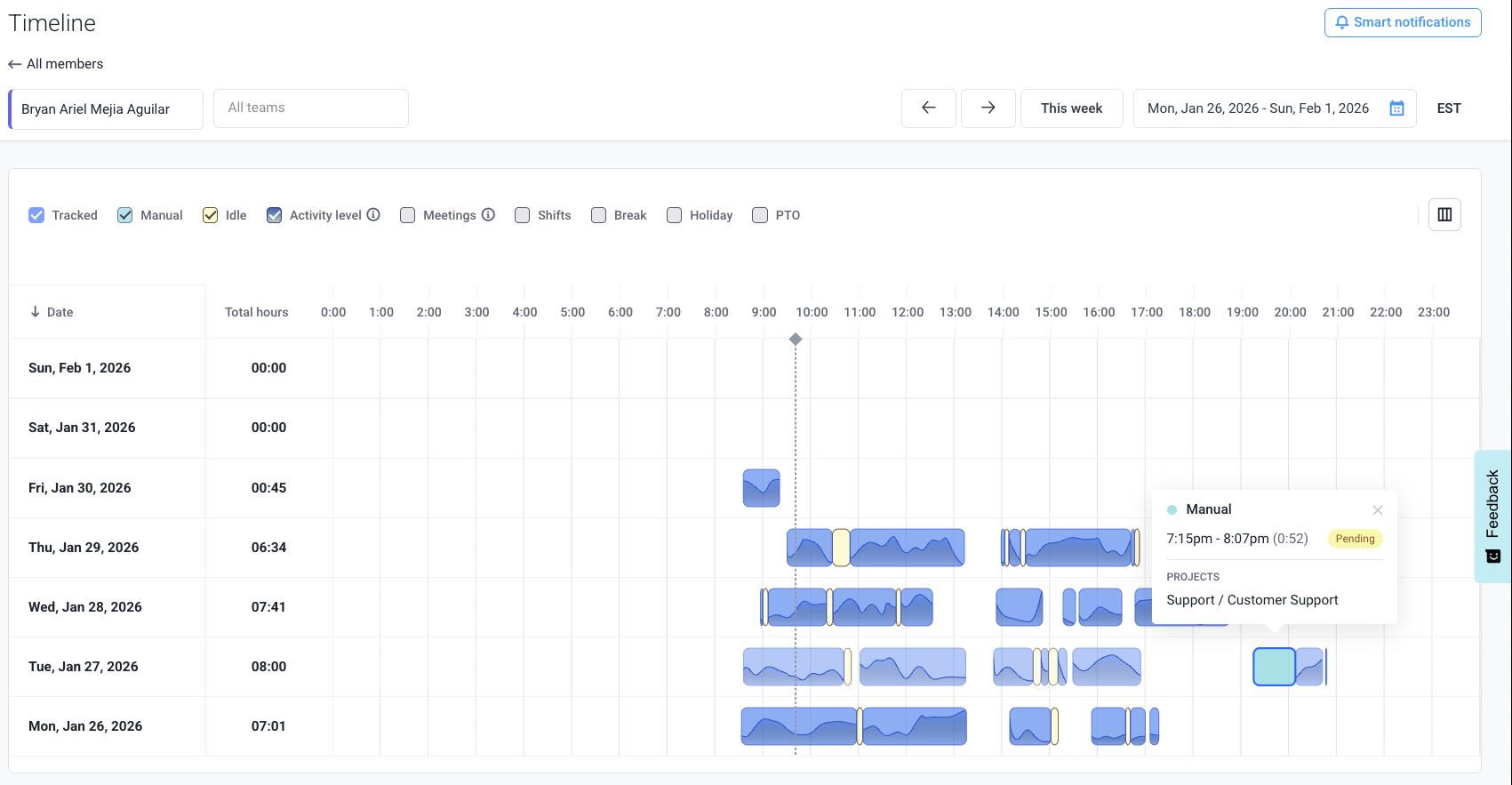
Idle time
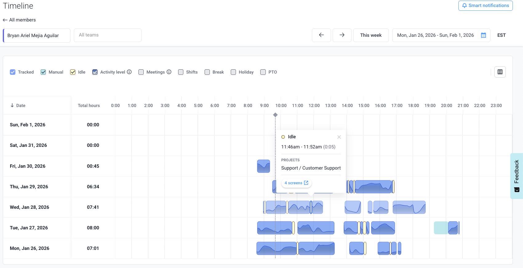
Activity level
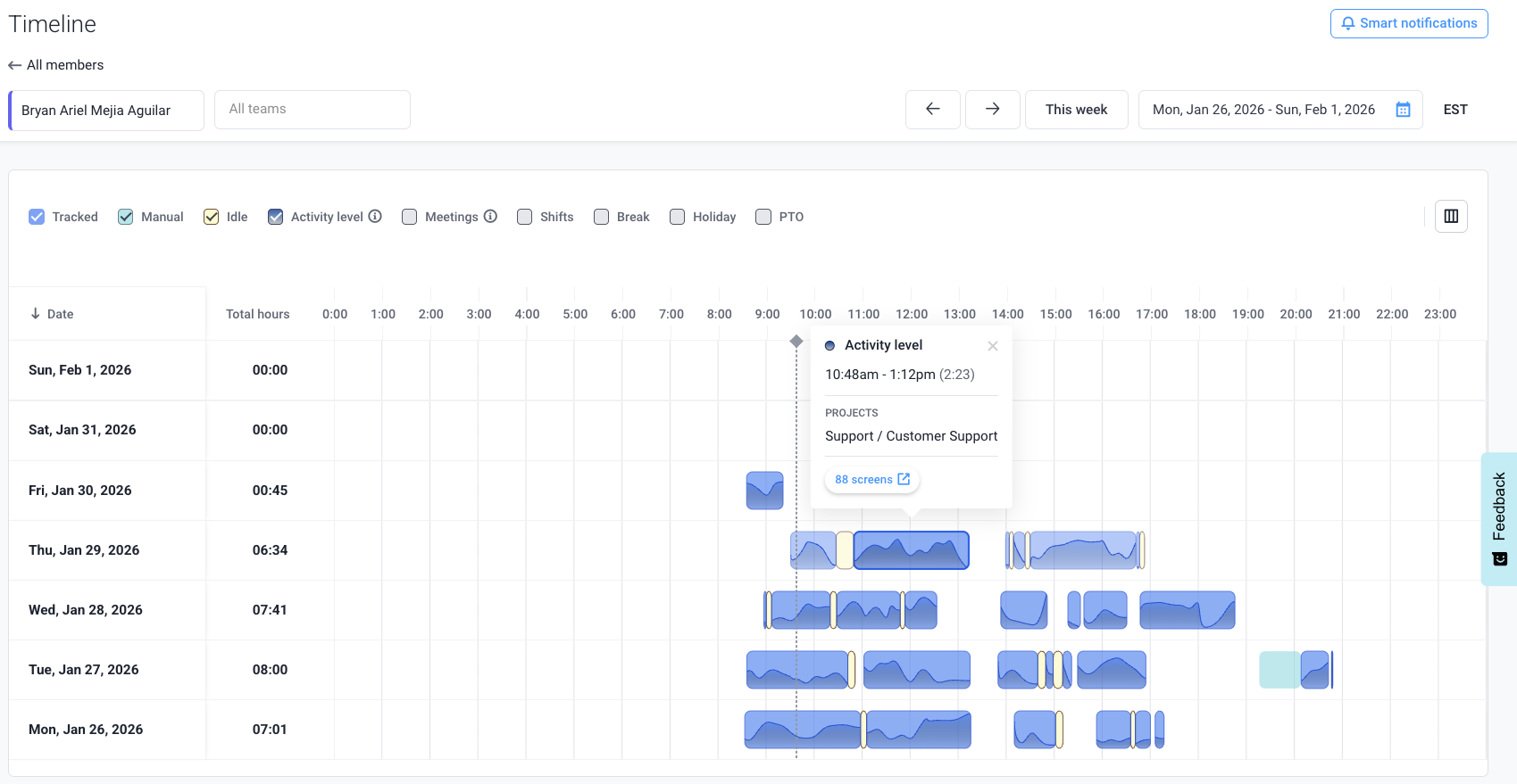
Time can also be classified as meetings, shifts, breaks, holidays, or PTO.
Unusual activity
When Hubstaff Insights is active for your organization, organization owners and managers are both informed, through the unusual activity widget, and notified through email about users employing software that mimic keyboard/mouse movements to produce simulated activity. To learn more about unusual activity, click here.
Output
Hubstaff Insights now offers an integration with Github. To set that up, please follow this guide.

Notifications

You can also see notifications about unusual activity on these sections:
- Insights page – Top Apps and URLs widget

- Settings & policies > Features > Insights > App and URL classification

Hubstaff Insights settings
To access the insights settings page, navigate to Settings & Policies > Features. Alternatively, you can navigate to the Insights menu on your sidebar then click Settings.

App/URL classification
Here you can classify apps and URLs as core/non-core work, and unproductive.

Smart notifications
Our smart notifications feature allows you to be notified through email, Slack, and/or within Insights by choosing specific criteria, such as members overworking, underworking, low/high activity, etc.
Smart notifications can be created for the following Hubstaff metrics:
- Daily work time
- Core work
- Non-core work
- Unproductive work
- Avg. activity rate
- Time spent on App
- Time spent on URL (Specify any custom URL(s) to monitor for)
- Suspicious applications
- Unusual activity
To create a custom smart notification, follow these steps:
Step 1
To add a new notification, first navigate to Insights and then select the Smart notifications button.
![]()
Step 2
Click on New notification and select a template or a custom notification.

You then may select a Smart Notification template to get started. Then, optionally customize the settings of the template.

Step 3
Add the notification name and notification frequency.

Frequencies available:
- Every hour
- Every day
- Every week
- Every month
Step 4
After adding the name, define the When section. For example, if you wish to add a smart notification about users exceeding an 8-hour workday, this is what your When section should look like:

Step 5
Next, define the Then section of the notification – this defines what happens when the When criteria has been met. Notifications can be sent to either teams or individual team members.

Step 6
Choose the delivery channel:

- Show on Insights – shows the notification within the Insights > highlights tab.
- Send via email – sends the notification via the designated email address.
- Send to Slack – (can be enabled when the Slack integration is connected) sends a notification via Slack.
Step 7
Finally, click Save to commit your changes.
![]()
Below is a sample smart notification email for work hours exceeding 30 minutes per day:

Privacy controls
Turning this setting on will hide individual members application and URL data recordings adding a layer of privacy.
Insights page:

Reports page:

To enable this feature, navigate to Settings & policies > Features > Activity > Data privacy. On the settings page, you can toggle the global setting to change it for the entire organization or toggle individual settings.
