8 minutes
Viewing a graphical representation of data in reports
It is now possible to view a graphical representation of Hubstaff’s reporting data in our Daily, Time & Activities, Amounts Owned and Payments reports.
How to Toggle the Graph View
To toggle the graph view, simply click on the rectangular blue button with the image of the graph on it. It is located to the far right of the screen as shown below.
If you wish to disable the graph view, simply click on the same burf45. xtton again.
Please note this setting is carried across to all of your reports. For example, if you disable graphs in the weekly report, it will also be disabled in the Time & Activities report. To enable it you can simply click on the button again.
Me/All Filter
Each report can be filtered to show your own data (ME) or a data for your team (ALL). Simply click on ME or ALL to toggle the view.
Graphs in the Daily Report
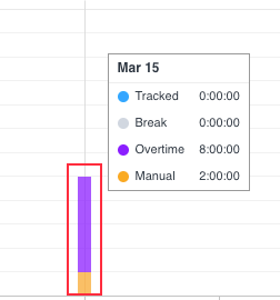
The Daily report displays data in the form of a bar chart. You can view your own data by clicking on the Me section, or display data for your entire team by clicking on the All option.
The All section will show how many hours each team member has tracked for a day up to 31 days. It will also display a breakdown between Manual time, Breaks, Overtime, Holidays, Time off, and Time tracked.
Filtering Manual vs Tracked Time
Simply click on the orange or blue squares to filter the view between the two.
Click the orange square to only show manual hours tracked by your staff (an example is shown below).
Click the blue square to only show tracked hours logged by your staff (an example is shown below).
Graphs in the Time and Activities Report
The Time & Activities graph displays the total number of hours tracked each day, totaled consecutively, either for yourself or as a total for your entire team.
You can filter the date by clicking on the calendar icon and selecting your preferred date range. The graph will then be interpreted in accordance with the date range you select.
To quickly view the total number of hours tracked for a certain day, you can simply hover your cursor over a circle on the graph. The data will immediately be displayed beside your cursor.
Graphs in the Amounts Owed Report
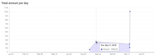
The Amounts Owed report will display the dollar amount members are owed over a given period, per day totaled consecutively.
To quickly view the total amount owing for a certain day, you can simply hover your cursor over a circle on the graph. The data will immediately be displayed beside your cursor.
You can filter the date by clicking on the calendar icon and selecting your preferred date range. The graph will then be interpreted in accordance with the date range you select.
Graphs in the Payments Report
The Payments report will display the total dollar amount you have paid your employees over a given period, totaled consecutively, in a given period.
To quickly view the total payments for a certain day, you can simply hover your cursor over a circle on the graph. The data will immediately be displayed beside your cursor.
You can filter the date by clicking on the calendar icon and selecting your preferred date range. The graph will then be interpreted in accordance with the date range you select.


